Create a Custom Theme in SharePoint Online
By
 Khoa Q.
Published a year ago
~5 minute read

SharePoint Online has introduced an exciting new feature that empowers users to create custom themes directly from the user interface. This new capability eliminates the need for complex coding or external tools, making it easier for end users and site administrators to personalize their SharePoint sites to reflect their organization's branding and style.
In this guide, we’ll walk you through the simple two-step process to create a theme and apply it to your SharePoint site. With a friendly tone and clear explanations, this article is designed to help everyone—no matter their technical expertise—use this feature effectively.
Why Themes Matter in SharePoint
Themes are more than just colors; they play a crucial role in defining the visual identity of your SharePoint site. A well-designed theme ensures that your site:
- Aligns with your organization’s brand.
- Enhances user experience by improving readability and navigation.
- Creates a professional and cohesive appearance.
With the new theme creation feature, SharePoint Online makes it simple for everyone to design themes that look great and are easy to use.
Accessing the Theme Creation Tool
To get started, navigate to your SharePoint site and follow these steps:
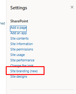
- Click the gear icon in the top-right corner of your site.
- Select Site branding from the dropdown menu.

This will take you to the theme creation interface, where you can start designing your custom theme.
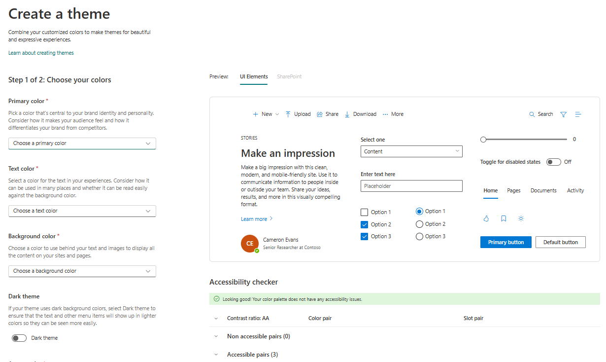
Step 1: Choose Your Colors
In the first step, you’ll select the core colors that will define your theme. SharePoint provides an intuitive interface for selecting these colors, along with helpful tips to guide your decisions.

Primary Color
The primary color is the anchor of your theme. It represents your brand's identity and personality. When choosing your primary color, think about:
- Brand alignment: Does this color match your logo or other branding materials?
- Emotional impact: Colors evoke feelings—choose one that aligns with the mood you want to convey.
- Contrast: Ensure it stands out against the background and complements your other colors.
Click Choose a primary color to open a color picker. You can select from the palette or enter a specific HEX code for precision.
Text Color
Text color is one of the most critical elements for accessibility and readability. Consider:
- Contrast ratio: Your text should be easily readable against the background.
- Versatility: Pick a color that works well across various sections of your site, including headers, body text, and links.
Click Choose a text color to pick a shade that complements your primary and background colors.
Background Color
The background color is the canvas for your site. It frames your content and impacts the overall aesthetic. Tips for selecting a background color:
- Subtlety: A neutral or muted background helps other elements stand out.
- Consistency: Make sure it aligns with your brand’s visual style.
Click Choose a background color to make your selection.
Dark Theme (Optional)
If you prefer a darker color scheme, enable the Dark theme option. This ensures that text and other elements adapt to lighter colors, improving visibility and readability. Dark themes can be particularly effective for sites with modern, high-tech aesthetics or those viewed in low-light conditions.
Accent Color
Accent colors are used sparingly but effectively to draw attention to specific elements, like buttons, links, or highlights. When selecting an accent color, think about:
- Contrast: It should complement, not clash with, your primary and background colors.
- Emphasis: Use this color to guide users’ eyes to important areas.
Click Choose an accent color and experiment with options that add a pop of personality to your theme.
Moving to the Next Step
Once you’ve chosen all your colors, click Next to proceed to Step 2. SharePoint will guide you seamlessly to the naming and accessibility review page.
Step 2: Name Your Theme and Check Accessibility
The second step focuses on naming your theme and ensuring it meets accessibility standards.
Naming Your Theme
A descriptive name helps administrators and users easily identify the purpose of the theme. Consider including:
- Purpose: Indicate where or how the theme will be used (e.g., “Marketing Team Theme” or “Dark Corporate Theme”).
- Clarity: Keep it straightforward and recognizable.
Enter your theme’s name in the Name your theme field.
Accessibility Reminder
Accessibility is a critical aspect of web design. SharePoint provides a reminder to:
- Check color combinations: Ensure your theme is usable by people with color blindness or other visual impairments.
- Test contrast: Verify that text is legible against the background.
Use tools like the WebAIM Contrast Checker to confirm your theme meets accessibility standards.
Saving Your Theme
Once you’re satisfied with your theme’s name and accessibility, click Save. Your new theme will now be available for use.
Applying Your Custom Theme
After creating your theme, it’s easy to apply it to your site. Follow these steps:
- Click the gear icon in the top-right corner.
- Select Change the look > Theme.
- Choose your newly created theme from the list.
- Click Apply to update your site’s appearance.
Your SharePoint site will instantly transform with the new colors and styles you’ve designed.
Best Practices for Theme Creation
To make the most of this feature, keep these best practices in mind:
- Simplicity: Avoid using too many colors; a clean design is more professional and easier to navigate.
- Consistency: Align your theme with your organization’s branding for a cohesive look.
- Accessibility: Always prioritize readability and usability for all users.
- Testing: Preview your theme on different devices and screen sizes to ensure it looks great everywhere.
Benefits of the New Theme Creation Feature
The ability to create themes directly in SharePoint Online offers several advantages:
- Ease of Use: No technical skills required—just pick your colors and save.
- Customization: Tailor your site’s appearance to match your brand identity.
- Time-Saving: Eliminate the need for external tools or complex coding.
- Accessibility: Built-in reminders help you create inclusive designs.
The new theme creation feature in SharePoint Online is a game-changer for site customization. It empowers users to design beautiful, branded themes with just a few clicks, improving both the visual appeal and user experience of your SharePoint site.
Whether you’re a seasoned SharePoint administrator or a first-time user, this feature makes it easy to create professional, accessible themes that reflect your organization’s identity. Try it out today and give your site a fresh, personalized look!


